
Hello everyone, welcome back to another exciting article. In this article, we’ll do a simple data analysis project using R and R-studio. I have recently been looking into R and how it differs from Python when it comes to data analysis. I have learnt quite a lot about it. I have been exploring R-markdown and other R packages. I then looked into some data analysis sections and wanted to test myself on how well I can utilize R as a data analysis tool. I looked into some data sets on Kaggle that I could work with and decided to begin working on a dataset on GDP of countries between 2020 and 2025. You can find the dataset here on Kaggle So what is this dataset about and what is my objective? I’ll start with what my objective really is.
- I learnt some few things in R like R-markdown, I did a few demo programs on the side and wanted to see how this would be used in a real world project.
- I wanted to see, just how much control I have over R as a data analysis tool.
- I wanted to push myself to get better at doing research on using R packages and tools. What better way to do this other than a simple demo project I could experiment with on the side? I thought. While doing so, I thought why not share this with you. So here is how I got to this point.
Pre-requitise
To follow along with this project, you need to have some programming background in R and you have R-studio installed in your computer. You will also need to have internet access to download the dataset we will be using in this article. You might also need to open a Kaggle account.

Abit More On Dataset
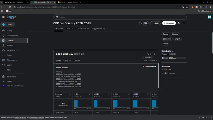
To first get started, I need to have access to some data I could work with. I began conducting some research on the internet and came across quite some number of datasets. I looked into a few like the Ebola datasets and decided to settle on the dataset on GDP for countries. Why this dataset? I choose this dataset as it was much easier to work with as I did not have to spend so much time cleaning the data and doing a lot of data wrangling. Something I would cover in other articles later on. This dataset will give me quite a gentle introduction to the world of R as a tool for data analysis.
GDP per Country 2020-2025
Country-level GDP (2020-2025), Annual Economic Datawww.kaggle.com
You can click on the link above to have access to the dataset in question.
Project Setup
Once I had this dataset, I needed to set up an R project. I learnt this earlier in my journey in introduction to R programming. So I went ahead and visited some of the notes I made during that time and implemented a template for a simple R project.
Let’s go ahead and fire up our R-studio first.
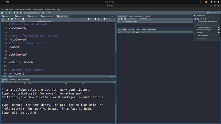
Once its fired up, on the top right of your screen, click on Project (None). This should display a drop down you can click on, as shown in the image above. Then go ahead and click on “New Project”.
New Directory Project

Click on the New Directory option you should see a list of option. Since we are keeping things simple for the mean time, just go ahead and click on New Project

Type in the name of the project, I am using “gdp-per-country-analysis” project name. Avoid spaces in between words, some operating systems might have an issue with this. As a rule of thumb, using - in between words and keep your project names very descriptive. You can also browse the directory to store the project on your computer. I like to check the “open in new session” field to start in a new session with clear memory.
You can also add in a git repo if you want to, this is version control. If you are not familiar with version control, it’s all fine, we’ll go over it. So I suggest you check this field too.
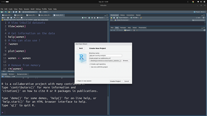
Once you are set to go, click on the “Create Project” button. This should start a new R session and reopen the editor.


Creating Project Folder Structure
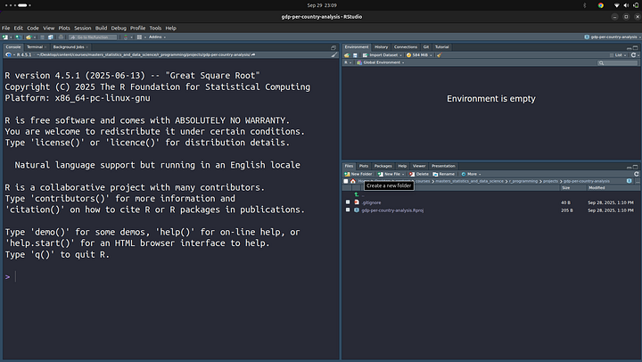
Once we have the project setup, we can now move on ahead and create the folder structure we’ll be following for our project.
Data Sub-folder
This folder will house the CSV files that we’ll be analysing in our project. So, for the meantime, let’s download the file we’ll be analysing and store it in the data folder. We’ll use this CSV file later on. In a typical R project setup, this will house all your data files.
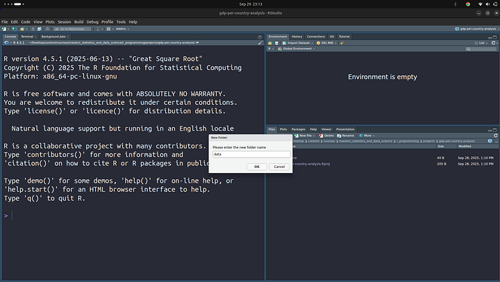
First, before we go ahead, we can create the folder we need. You can do this by clicking on the “New Folder” button in the “Files” section on the right of your screen in R-studio.

Once that is done, you can download the file using this link.
For you to be able to download the file, you’ll need to open up an account on Kaggle. Go ahead and do that then you’ll be able to download the file using the link from above.
Click on the download button above to download the file. Once the file has been downloaded, copy it from where it was saved and move it into the folder we just created.
That is all we need to do in the data folder for the mean time. We’ll revert back to it.
Outputs Sub-folder
The outputs sub-folder in our project directory gives you an idea of what it does, at least looking at the name of the folder “outputs”. It is used to store images of graphs and exported documents from R. You can store in here diagrams of plots and other files that are created as a result of your R program or your analysis.
Let’s go ahead and create this sub-directory. Follow the same steps we used to create the “data” sub-folder.Once this is done, your project directory should now look like so:

Scripts Sub-folder
The scripts sub-folder is where we’ll store all our R script files. All our .R files would go in here. Following the same steps as above, let’s go ahead and create this folder.
.gitignore
The .gitignore pronounced as “Dot Git Ignore” file is created when you select the option of version control when you create the project. This file is simply a text file where you can add in file paths (file names) that you do not want pushed to version control. This is for those of us who opted to add in version control. If you did not, all good. But this is good practice in the world of version control.
gdp-pre-country-analysis.Rproj
This file is used to store information about your R project, this is the configuration file for your project. This file is simply a text file, but if you click on it, it should open R-studio and load in the project into R-studio. You can open it as a normal file as well.
Right click on it and select the “open with” option, then select a simple text editor available on most operating systems.

For the Linux homies, like myself, I’ll use the gedit to open this file:

This is the content of the file, here it has all the different settings you have opted to use in your project.

Let’s go ahead and play around with some of the settings to and we should see the changes in this file. For now, you can go on ahead and close it, the opened file that is.
Once closed, go back into R-studio and click on the configuration file, the .Rproj file we just closed. This should open up the “Project Options” panel.

Here you can make changes to your project and this will be saved into the .Rproj file. For example, let’s turn off the “Save workspace to .RData on exit” option. After changing to “yes”

We can now open the .Rproj config file and we should see this change reflect. Before that, make sure to save the setting by clicking on “ok” at the bottom of the Project Options panel.

You can now see the changes on line 4 in the file have been saved, it was previously “Default”, now it’s “Yes”. Okay, hope that gives you a bit more ideas on how the .Rproj works. Now, let’s revert all the changes we have made.
- Close the editor we just opened.
- Go back into R-studio and change “Save workspace to .RData on exit” back to “Default” and click on okay.

At this point, your folder structure should look similar to mine:

What is “master”, well this is version control. It simply means I am on the master branch. We’ll not go into this on a deeper level, but you can read more about what a branch is in Git.
Creating Our First Script
Now that we have the project setup, we can now move on ahead and create the project’s first script file and use it to load in some data we’ll be working with. Here are the steps you’ll need to follow to do this:
- Click on the
scriptsfolder - Click on create “New File” option and select R Markdown. If it is your first time using R Markdown, you’ll be prompted to install a couple of packages.
- Give the file a name, in my case I called it “gdp-analysis.Rmd”
.Rmdis the extension for R markdown. This should open up the file once it is created
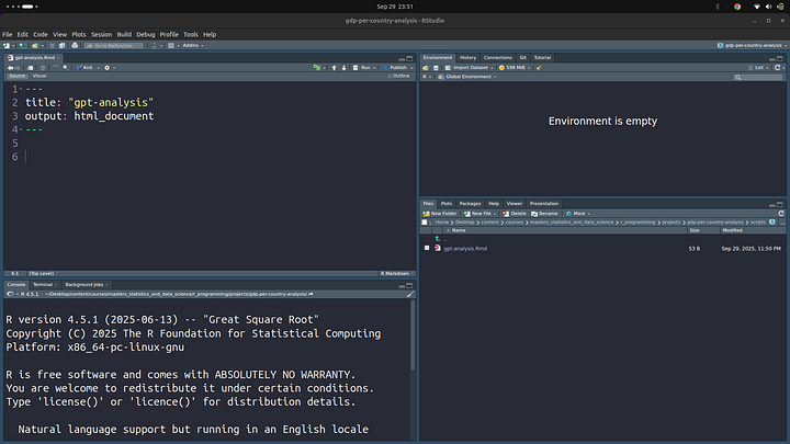
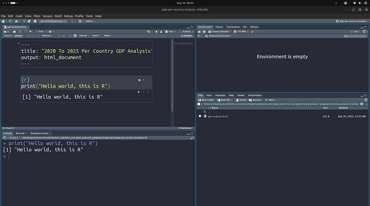
We can give the project a better title, I’ll go with: “2020 To 2025 Per Country GDP Analysis”

Once done, I want us to discuss a view of the viewports we get in R-studio when working with R-markdown

You can see we have “Source” and “Visual”. Source shows what we see in the image above, raw unformatted markdown. The Visual mode shows formatted content. To see the difference between the two modes better, let’s go ahead and create a simple R code cell in markdown. To do this, type in the following, make sure you are within the “Source” mode.
```{r}

```
NOTE: Those are back-ticks not qoutes.
You can also create this using the keyboard shortcut of Ctrl + Alt + I
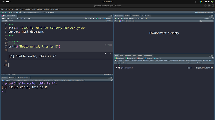
Once done, you can add in a simple “Hello world” message, we’ll print this out:

You can click on the tiny play button next to it to run the code. This is what I get in my case:
Now, to see the real difference between the two view ports (Source and Visual), let’s switch to the “Visual” mode. This is how it looks.
Let’s go back to the “Source” mode and add some more Markdown. A bit prior knowledge of Markdown will do you good in this section, but if no prior knowledge of Markdown, well, still good. Let’s add some text to our Markdown.
- Click on an empty section in the “Visual” mode and type in:
## Hello World
This will be displayed as heading 2. Here are few more examples:
# -> Heading 1
## -> Heading 2
### -> Heading 3
Once this is done, we’ll be back to more Markdown in a second. For the meantime, click on the “Knit” button in your R-studio editor. This will ask you to install some packages if you do not already have them installed. Please accept and let the packages be installed. The “Knit” option is used to export your R-markdown file to other formats like PDF files and HTML files in case you need to present a report on your analysis work. When I click on “Knit” I get a HTML file and it looks like this:

That is not very pretty. We have some options to make it look prettier. Run this command to install prettydoc on your machine:
install.packages("prettydoc")
You can run this command in your R console in the terminal
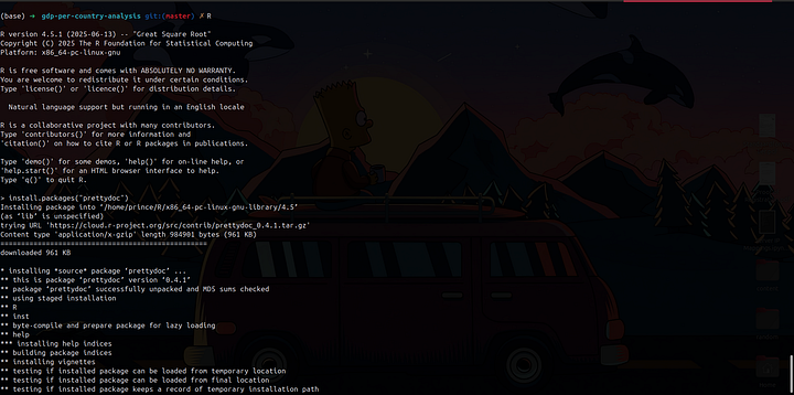
You can also run this in the R-markdown file we just created as well. Simply create an R code cell and paste in the code from above, that should get the job done as well.
You can read more about prettydoc from these links:
prettydoc
Creating Pretty Documents From R Markdownprettydoc.statr.me
prettydoc: Creating Pretty Documents from R Markdown version 0.4.1 from CRAN
Creating tiny yet beautiful documents and vignettes from R Markdown. The package provides the ‘html_pretty’ output…rdrr.io
Once you have that installed, you can exit R console using:
q()

Once done, you can now update your Markdown File to have the following content:
---
title: "2020 To 2025 Per Country GDP Analysis"
date: "2025-09-23"
author: "Prince Krampah"
output:
  prettydoc::html_pretty:
    theme: hpstr
    highlight: github
---

## Hello World

```{r}
print("Hello world, this is R")
```

Great, you can now go ahead and click on the “Knit” option to generate the file in HTML.
Here is a variety of themes you can use, more on themes in the shared links above:


These are but, a few of the available theme you can explore.
Loading Data
Now, let’s move on ahead and load in our CSV dataset. We’ll begin by first loading in some packages that we’ll make use of. Create an R cell and add the following:
if (require("pacman")) installed.packages("pacman")

pacman::p_load(
  tidyverse,
  flextable,
  esquisse,
  plotly
)
The .Rmd file should look like:
---
title: "2020 To 2025 Per Country GDP Analysis"
date: "2025-09-23"
author: "Prince Krampah"
output:
  prettydoc::html_pretty:
    theme: hpstr
    highlight: github
---

## Imports

```{r}
if (require("pacman")) installed.packages("pacman")

pacman::p_load(
  tidyverse,
  flextable,
  esquisse,
  plotly
)
```

## Load In Data

```{r}
df <-
```
Explore and Visualize Your Data Interactively
A shiny gadget to create ggplot2 figures interactively with drag-and-drop to map your variables to different…dreamrs.github.io
Using the flextable R package
Flextable documentation, an R package for generating reporting tables from R in Word, HTML, PDF, PowerPoint, RTF and…ardata-fr.github.io
Tidyverse
The tidyverse is an integrated collection of R packages designed to make data science fast, fluid, and fun.www.tidyverse.org
You can read more about all the packages we have imported using the links above. If you are running this in the “Visual” mode and do not want to see all outputs each time you import a library, or some warning messages, you can turn them off, not show these outputs:

Click on the gear icon next to the cell you wish to update:

Now go ahead and set the options as you wish. I do not want any warming and message outpus, so I’ll turn them off:

Once done, you can go ahead and click on “Apply”. You should now see some changes next to the {r} in the markdown
{r message=FALSE, warning=FALSE}
if (require("pacman")) installed.packages("pacman")

pacman::p_load(
  tidyverse,
  flextable,
  esquisse,
  here,
  psych,
  plotly
)
You can now see: {r message=FALSE, warning=FALSE} . You can also manually set this option if you want to.
Load CSV FIle
Now, that we brought in some packages, I know I have not talked much about what each of these packages does, we’ll look into them later down the line, probably in another article. We are now ready to import our CSV file. Create another R cell and add in the following code:
df <- read.csv(here("./data/2020-2025.csv"), check.names = FALSE)
head(df, n=5)
check.name prevents R from adding some characters in front of numbers like 2020, this is a column name and I expect R to threat it as a character. R threats as a number and adds “X” to it to make it a string, what we call character in R.

That table does not look very attractive, to make it look better, we can use flextable, one of the packages we imported(loaded in).
flextable::flextable(head(df)) %>%
  set_table_properties(layout = "autofit") %>%
  autofit()

At this point, you can click on the “knit” option to generate the HTML file that you can see and export. For the mean time, I’ll leave that upto you to do.
Data Cleaning
Once we have the data loaded and did some basic descriptive statistics, we can now move on to cleaning the data into a form that is much easier to work with when it comes to analysis. We’ll do this process in a set of stages. Let’s get started!
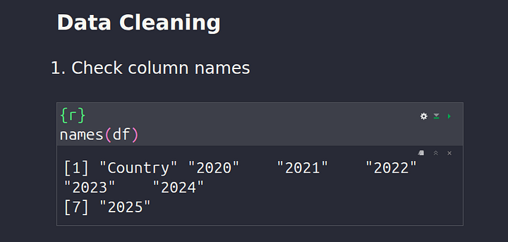
Check Column Names
To check the names of all the columns in our dataset, we can use the code below:
names(df)
Check Shape (Dimension) Of The Dataframe
We can obtain more details about our dataset by using the dimension property of a dataframe. The dimension property shows all the available number of rows and columns. We’ll also use some R markdown to make it look prettier. This ability to have R code in your markdown is one thing I love about R moving over from Python.

Okay so how did I put the R code in my markdown? To understand this, I’ll show you the content of my Source:
So, we have `r dim(df)[1]` rows and `r dim(df)[2]` columns.
You simply use back ticks! When I knit the document, this is what I get back.

Descriptive Stats
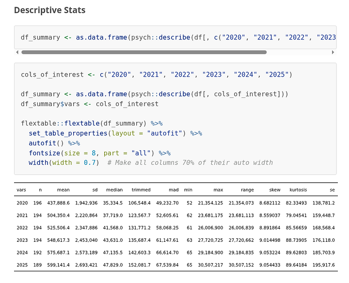
Moving on, let’s look into how to quickly generate some descriptive data for your dataset and audience to quickly go through for faster and quicker understanding of the dataset and your report. Here is the R code for this section:
df_summary <- as.data.frame(
psych::describe(
df[, c("2020", "2021",
"2022", "2023",
"2024", "2025")
]))
cols_of_interest <- c("2020", "2021", "2022", "2023", "2024", "2025")

df_summary <- as.data.frame(psych::describe(df[, cols_of_interest]))
df_summary$vars <- cols_of_interest

flextable::flextable(df_summary) %>%
  set_table_properties(layout = "autofit") %>%
  autofit() %>%
  fontsize(size = 8, part = "all") %>%
  width(width = 0.7)
When I click on “knit”, this is what I get back:
Checking For And Removing NA Values
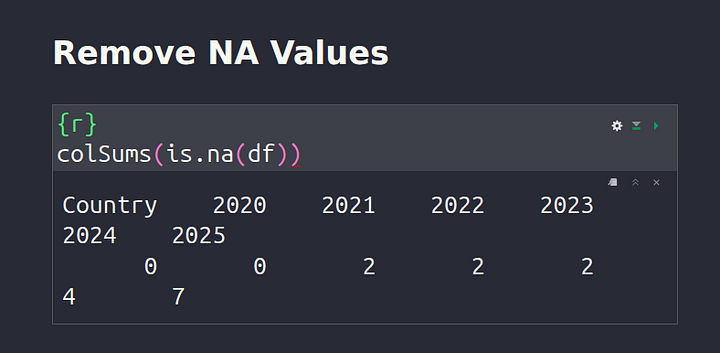
In data science and in the world at large, very often when data is collected, we get some missing data points. These are typically called NA values or NaN (Not A Number) for our Pythonic fellows. These are simply blank spaces in our dataset, we need to process and remove these blank spaces. To achieve a dataset with no NA values, let’s start off by first checking if NA values exist in your dataset.
colSums(is.na(df))
The code above will return to us a sum of all the NA values for each column respectively.
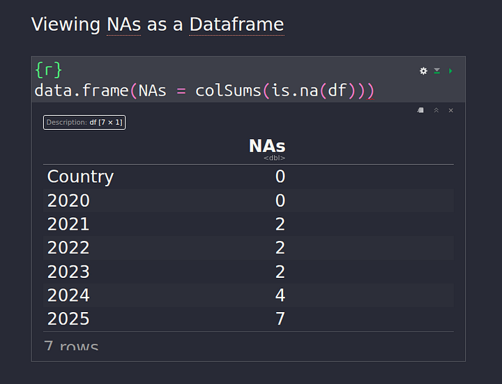
We can also get a better view by creating a dataframe:
data.frame(NAs = colSums(is.na(df)))
Replacing the NA values should be our next step now that we know NA values exist in our data. There are various ways to do this, some people use mean, others use median, the row value before the row with NA. All these techniques are called Imputation Methods.
In our case, I’ll use median instead of mean. This is because, countries with really high GDP cause the GDP distribution to be heavily skewed on one side, shifting the mean value with it, making the use of mean not an accurate representation, for this we need to use the middle value, median is more robust and less affected by this skewness. Hope that was clear why I want to use median instead of mean.
For those of us interested in the Math, you can read more here: https://www.investopedia.com/terms/s/skewness.asp
for (col in cols_of_interest) {
  coi_median <- median(df[, col], na.rm = TRUE)
  df[is.na(df[, col]), col] <- coi_median
}
Now, we can check if there are still any NA values in our data:
colSums(is.na(df))

Data Analysis
Finally, we are done with all the dirty but necessary work, pheew! We can now go on ahead and do some data analysis and gain some insights finally!
Top 5 Countries With Most GDP
We’ll first begin by plotting some bar graphs to show top 5 countries with the highest GDP for each of the years in our dataset. Most of us know who the first country is in each case already, but let’s look at what the data has to say about it.
for (col in cols_of_interest){
  specific_col <- df[
    order(df[, col],
          decreasing = TRUE),
    ]

  top_10 <- head(specific_col, 10)

  barplot(top_10[, col],
          names.arg = top_10$Country,
          ylab = "GDP",
          cex.names = 0.8, # Adjust label size
          las = 2,  # Rotate labels
          col = "steelblue",
          # horiz = TRUE, # Make it horizontal
          main = glue("GDP {col} By Country")
  )
}
Here is an image after I knit the markdown:

The code used for this is as follows:
for (col in cols_of_interest){
  specific_col <- df[
    order(df[, col],
          decreasing = TRUE),
    ]

  top_10 <- head(specific_col, 10)

  # Convert to billions (since data is in millions)
  gdp_billions <- top_10[, col] / 1e3

  # Add nargin (bottom, left, top, right)
  par(mar = c(5, 6, 4, 2))

  barplot(gdp_billions,
          names.arg = top_10$Country,
          ylab = "GDP (Billion, Currency USD)",
          cex.names = 0.8,
          las = 2,
          col = "steelblue",
          main = glue(
            "GDP {col} By Country"
          ),
          yaxt = "n",
          # Mover ylab out
          mgp = c(4.5, 1, 0)
  )

  axis(2, at = axTicks(2), labels = format(axTicks(2), big.mark = ",", scientific = FALSE), las = 1)
}
Global GDP Trend Analysis
Now, let’s look at some global trends in our data.
Median GDP Distribution For Each Year
I want to see the median distribution over the years.

Here is the code for this:
ggplot(df_by_year) +
  aes(x = Year, y = Median_GDP) +
  geom_line(group = 1, color = "#112446", size = 1) +
  geom_point(color = "#112446", size = 3) +    # Add points to make it clearer
  labs(
    x = "Year",
    y = "GDP (Currency USD)",
    title = "Median GDP Trend Over Years (2020-2025"
  ) +
  theme_minimal()
Top 10 Countries by GDP Growth (2020–2025)
I would like to know the countries that had the larges growth between the years of 2020 and 2025, by GDP.

Code used:
df$GDPGrowthPnt <- ((df$`2025` - df$`2020`) / df$`2020`) * 100


df_sorted <- df[order(df$GDPGrowthPnt, decreasing = TRUE), ] %>% head(n = 10)

barplot(df_sorted$GDPGrowthPnt,
        names.arg = df_sorted$Country,
        ylab = "GDP Growth (%)",
        xlab = "Country",
        cex.names = 0.8,
        las = 2,  # Rotate labels
        col = "steelblue",
        main = "Top 10 Countries by GDP Growth (2020-2025)",
        mgp = c(4, 1, 0)
)
Country Specific Analysis (Ghana)
I now, want to see some country specific trends in GDP. I’ll focus on Ghana, my country!
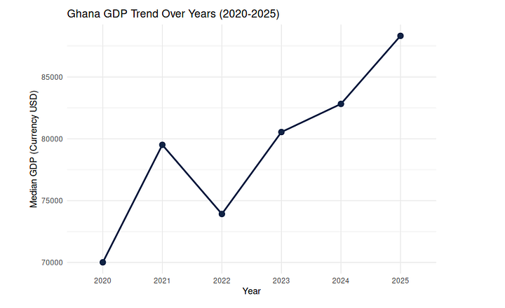
The code for this is:
get_country_specific_df <- function(country = "Ghana"){
  country_df <- global_trend_df[global_trend_df$Country == country, ]

  return(country_df)
}

ghana_gdp_df <- get_country_specific_df(country="Ghana")

ghana_gdp_df
plot_country_specific_df <- function(country_specific_df){
  ggplot(country_specific_df) +
  aes(x = Year, y = GDP) +
  geom_line(group = 1, color = "#112446", size = 1) +
  geom_point(color = "#112446", size = 3) +    # Add points to make it clearer
  labs(
    x = "Year",
    y = "GDP (Currency USD)",
    title = glue("{country_specific_df$Country[1]} GDP Trend Over Years (2020-2025)")
  ) +
  theme_minimal()

}

plot_country_specific_df(ghana_gdp_df)
I’ll extend this to other countries as well:

Here is the code I used to achieve this:
countries_of_interest <- c("Ghana", "Kenya", "Tanzania", "Nigeria")

for (c in countries_of_interest){
  gdp_df <- get_country_specific_df(country=c)
  print(plot_country_specific_df(gdp_df))

}

Preparing Final Report
When it comes to presenting your final report, the last thing you wish to do is leave the code in the knitted files. Some of your audience are not technical people, they do not want to know anything about the code, what you should do instead is use words along with graphs/tables from your analysis to explain your findings. I’ll keep things simple in this project and just use the graphs. So we can now go back and disable the code cells we do not need. We have seen how to do this, I encourage you to go back in the article and read the section where we did this.
TIP: Use the output settings to control whether to include a given code block in the knitted file or not

Exporting A PDF Of Your Analysis
Once we are done conducting some analysis, we can export our final report as a PDF. In doing so, make sure not to include our show the code in your final exported PDF file. You can do this by excluding the code from the final knitted PDF files. We have went over how to do that in this section, but here is a quick reminder:

Do not forget to click on “Apply” once done, in my case, I selected the “Show output only” to only show the output of the executed code.
To export the file as a PDF, we’ll have to add in some additional settings as well. I did that in the first cell, where we previously specified to knit as a HTML file, update this section of your code to be as follows:
---
title: "2020 To 2025 Per Country GDP Analysis"
date: "2025-09-23"
author: "Prince Krampah"
output:
  pdf_document:
    latex_engine: xelatex
    highlight: kate
    toc: true
    toc_depth: 2
    number_sections: true
    fig_caption: true
    keep_tex: false
---
Once done, click on the “knit” option to generate the PDF file. Again, go through your code and try to explain each section in depth. I’ll try to write another article where we go ahead and do just that.
Conclusion
Congratulations for making it to the end! In this article, you have gone on a journey with a Python developer’s first data analysis project in R. I hope you found it helpfull and learnt quite a handfull of useful content. Let me know what you think and what you wish me to write about next!
Other platforms where you can reach out to me:
Happy coding! And see you next time, the world keeps spinning.
Access To Code:
https://gist.github.com/Princekrampah/7b36519f48c504176a4a49a5c15fca8f